 Unless you're a graphic designer, you may not think often about fonts, but if you have any online presence at all, they are important. In fact, if you've ever made a sign they're important too!
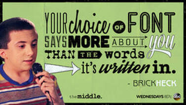
This post was inspired by the copious moving and garage sale signs I've seen this summer that are completely illegible from the road. The lettering is either too faint, or too small, or too sloppy. The lesson: what is the purpose of what you're writing? Does your copy work for that audience? Now I'm not as addicted to fonts as Brock on "The Middle" (see what I mean here), but I do know that appearance and size of your copy is important to legibility, impact, and mood (yes, mood). If I want to evoke a playful mood and have something light to say, a sans serif font without much structure is appropriate (Comic Sans, Kristen, MV Boli). On a website like this, a serif font is important for easy legibility. Serif fonts are also used in formal business letters and documents. Sorry, but size IS important! Bet you can't read this well. And this is WAY too big for a website unless it's a heading. Color is also important. Be sure that there is contrast between your background and the text. I've seen badly designed websites and newsletters that have a brown background, for instance, with a lighter brown font. In this digital age, there are hundreds of downloadable choices available to enhance your writing, whether on paper or virtual. Explore your options and consider your audience!
0 Comments
Leave a Reply. |
 RSS Feed